Do Nothing Snake Sideways album cover redesign
The Station
For Beacon Hill and Columbia City residents, The Station is more than just a coffee house — it’s a gathering place for community dialogue and cultural connection. However, its existing branding didn’t reflect its distinctive role in the neighborhood or its roots in Seattle’s local history.
I set out to redesign The Station’s brand identity to better represent its character and legacy. The goal was to create a visual system that honored the spirit of Old Seattle while celebrating the diversity and personality of its owners and patrons.
Drawing inspiration from vintage sign painting and classic Seattle design cues, I developed a bright, inviting visual identity that feels both timeless and personal. The color palette and typography pay homage to the shop’s neighborhood roots while maintaining flexibility for digital and physical applications. I also built a brand framework to guide consistent expression across signage, packaging, and social media.
The new branding captures The Station’s identity as a welcoming, community-centered space — one that reflects its history while standing out among Seattle’s many coffee shops.

window decal featuring updated logo

take-away coffee cups

updated interior design mockup for The Station's Beacon Hill location


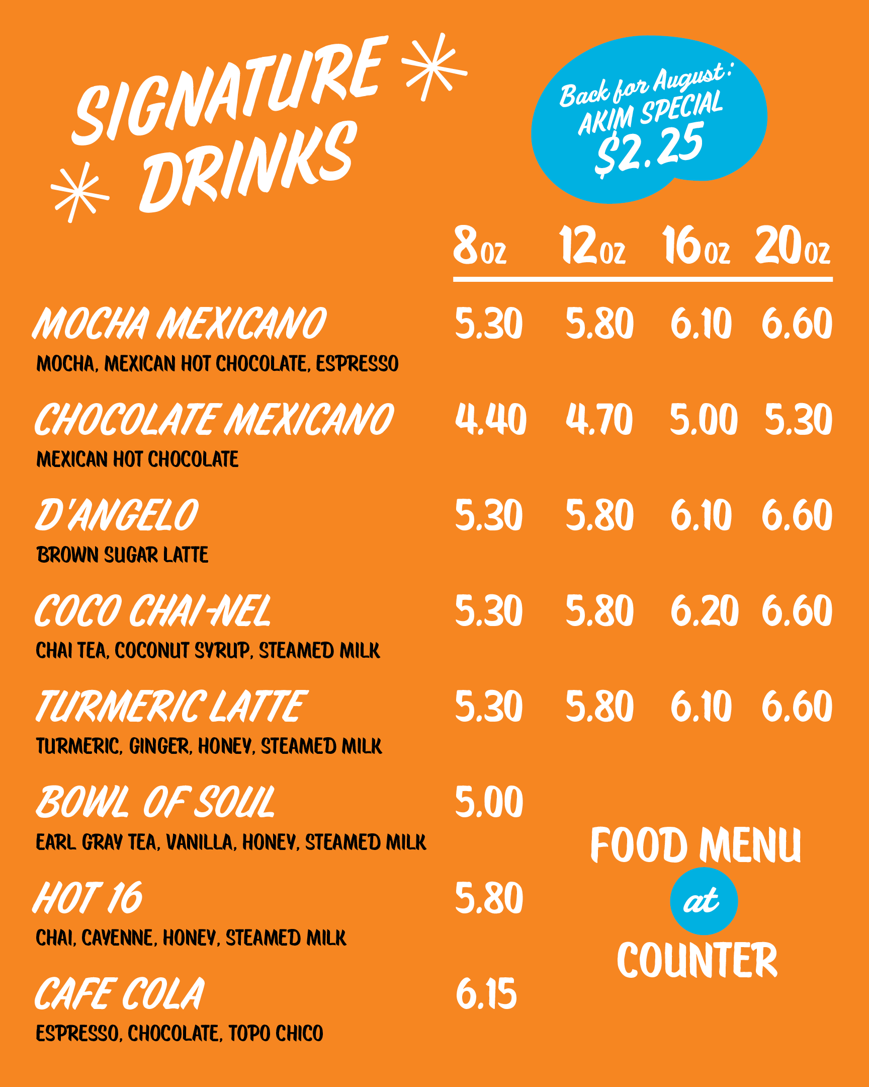
menu boards

packaging for whole bean coffee


train card advertisments
the updated brand guide for The Station
Process
Former branding & interior


The History of The Station
In 2010, Jose Luis Rodriguez and Leona Moore-Rodriguez opened The Station in a small Beacon Hill storefront. Today, The Station has become an indispensable part of the Beacon Hill and Columbia City communities. More than just a coffee shop, The Station is a gathering space for public discourse and social activism. Providing for a healthy and thriving community is a critical part of The Station’s mission, and that means serving and being accessible to all members of the community.
The Station's customers
The Station caters to the local Beacon Hill and Columbia City communities, and Seattle more broadly. They engage with the community by organizing fund-raisers and community events, usually at their brick-and-mortar locations.
The Station's values
The Station is a mission-driven business. The Station’s founders, Luis Rodriguez and Leona Moore-Rodriguez, are passionate about equity, inclusivity, and community outreach. Some of their sobriquets for The Station are “The hip hop coffee shop” and “a social justice coffee shop.” They want to provide a safe space for all Beacon Hill community members, even the homeless. The Station welcomes people even if they don’t buy anything.


Initial sketches for The Station's wordmark

My concept board for The Station drew inspiration from Mexican sign painting (Rotulos), neighborhood taquerias, and marigold flowers
Typography
The Station's wordmark includes a variety of sign-painting inspired scripts: Oldtown Signer Script, Sarah Script, and Ed's Market Design Elements. The hand-crafted look of these typefaces set The Station apart from the run Seattle coffee shops, most of which prefer a clean, geometric look. For body copy, I used Brother 1816, an typeface that comes from the LatinX owned type foundry TipoType.
Colors
My inspiration for the colors of The Station's rebrand came from Marigold flowers, which have a special significance in Latin culture. Marigolds are a common offering on alters in Mexico, and they are a mythological meaning that relates to love and devotion. I thought this was an appropriate symbol for The Station because it's owners are a BIPOC couple from Beacon Hill and Mexico.

The Station's redesigned wordmark with variants

A spread from the brand standards guide showing color palette and typography for The Station

A spread from the brand standards guide showing logo usage and mis-usage

A spread from the brand standards guide showing branding elements
Special thanks to Jess Ornelas for her feedback on this project

