

Funix project
Funix
Despite decades of evidence supporting phonics as the most effective method for teaching reading, few educational games use the Science of Reading approach. Many schools still rely on “Whole Language” methods, contributing to low literacy rates across the United States.
I set out to design a learning tool that would make phonics engaging and accessible for young readers. The goal was to create an educational game that combined effective pedagogy with inviting, child-friendly design.
The result was Funix, a flash-card–based game that teaches children to recognize letters, combine sounds, and form words. I designed the cards with a clean layout, dyslexia-friendly typography, and a warm color palette to promote focus and enjoyment.
Funix transforms phonics practice into an interactive experience that helps children build reading confidence through play.

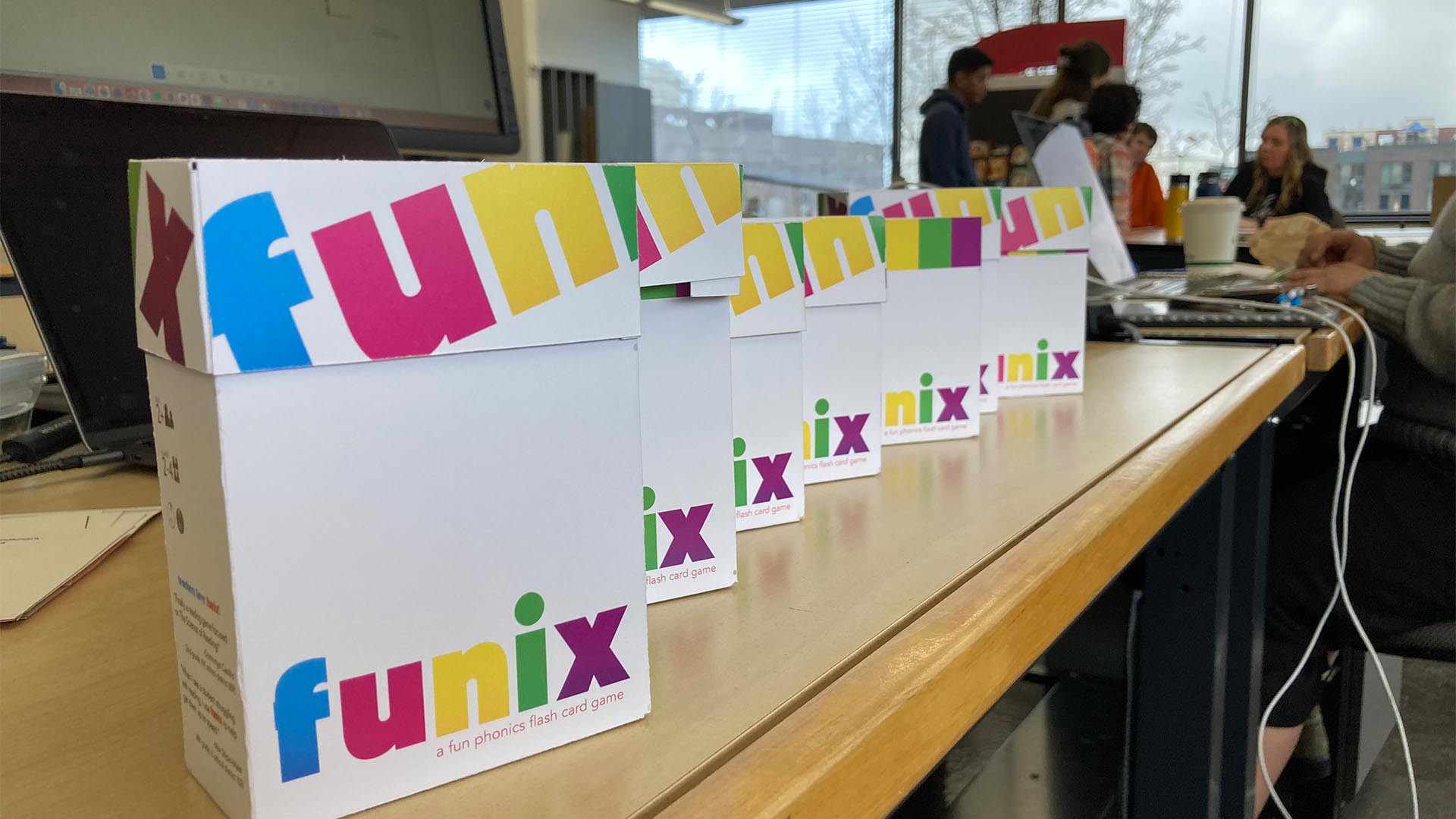
Final product mockup
The Funix Quick Start Guide is linked via QR code on the side of the packaging, giving parents and kids a fun introduction to the game
Funix
Process
I am indebted to the Seattle kid's game store Snapdoodle for letting me do my research there. With the help of their generous employees, I gathered images of other popular learning games. I learned that simplicity in game-play was a key driver of sales, and that learning games that included a tactile element also did well.

Pictures from my Snapdoodle research expedition
Typography
The primary typeface used on the Funix game cards is Trebuchet MS, which is a dyslexic-friendly font that uses subtle variations in its terminating strokes to differentiate between easily confused letters, lower-case d's and b's, for example. The Funix branding uses Alfarn for the display type, and Avenir Next for body copy. I know that using two sans-serif typefaces on one project is a little eccentric, but Trebuchet really only appears on the letter cards, and Avenir appears on the packaging and game cards, so they're kept somewhat seperate.
Colors
The most common response from my classmates about this project was a universal endorsement of the colors. Which is funny because I spent very little time in choosing them. Through my research, I knew that I needed to avoid dark colors and earth-tones. Bright and bold colors with plenty of white space would stick out on the shelf. The game cards themselves use colors from the Pantone uncoated book, their general harmony a fortuitous accident.

Testing different card sizes

Hand-made prototype to test gameplay

Example of letter card
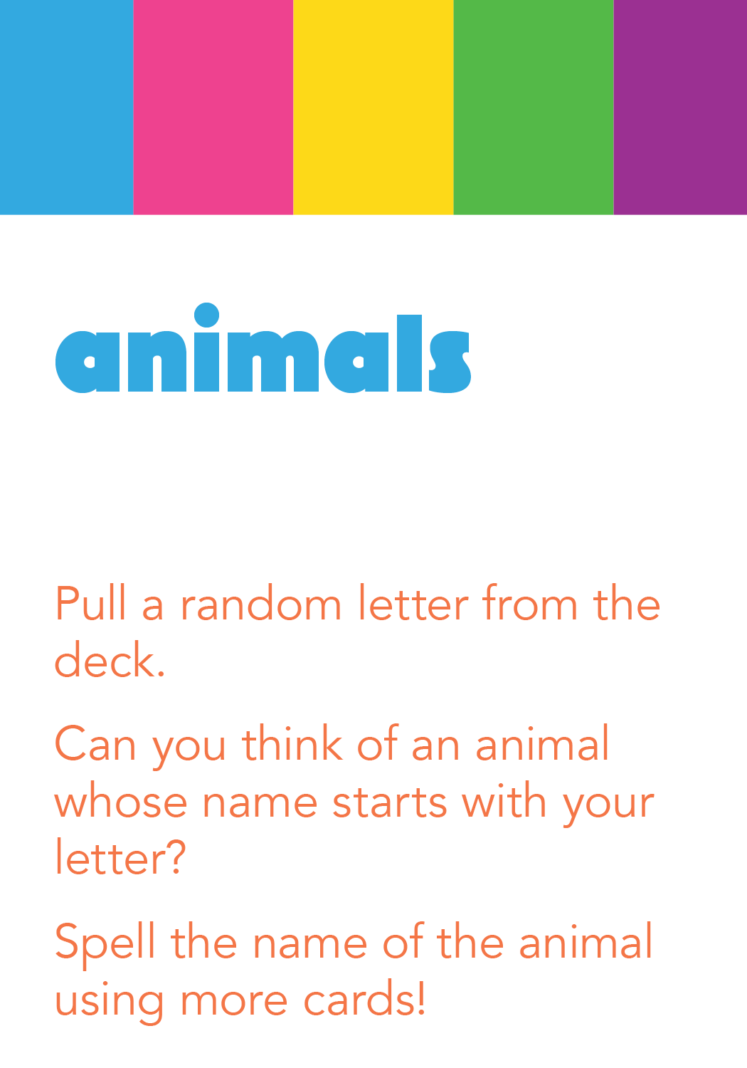
Example of game card

Showing how the cards are used to spell words

User testing with one of my classmates

Packaging design and dielines
Laser-cut packaging prototypes