

Funix project
Brittany Ater Therapy
After several years working within a Seattle therapists’ collective, Brittany Ater decided to open her own private practice in 2025. She needed a distinct brand identity that would set her apart from other local therapists while still feeling familiar and trustworthy within the wellness space.
Brittany wanted her brand to express her Pacific Northwest roots and evoke “warm blueberry oatmeal”—a sense of comfort, care, and authenticity. She wanted her logo to speak to stability despite impermanence and change. Her website needed to communicate her expertise, inspire confidence, and attract clients who would connect with her personal approach to therapy.
I developed a visual identity and website design that balanced warmth with professionalism. The palette and textures drew inspiration from natural Northwest tones—muted blues, soft neutrals, and organic shapes—creating a calm, grounded aesthetic.
Within two weeks of launching her new brand and website, Brittany’s client roster was full. Her branding now reflects her personality and values, helping her connect with clients who feel right at home from the first click.
Brittany's live website can be found at https://www.brittanyatertherapy.com
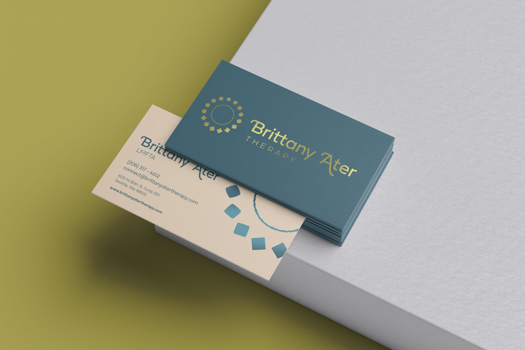
Brittany's business cards with new branding
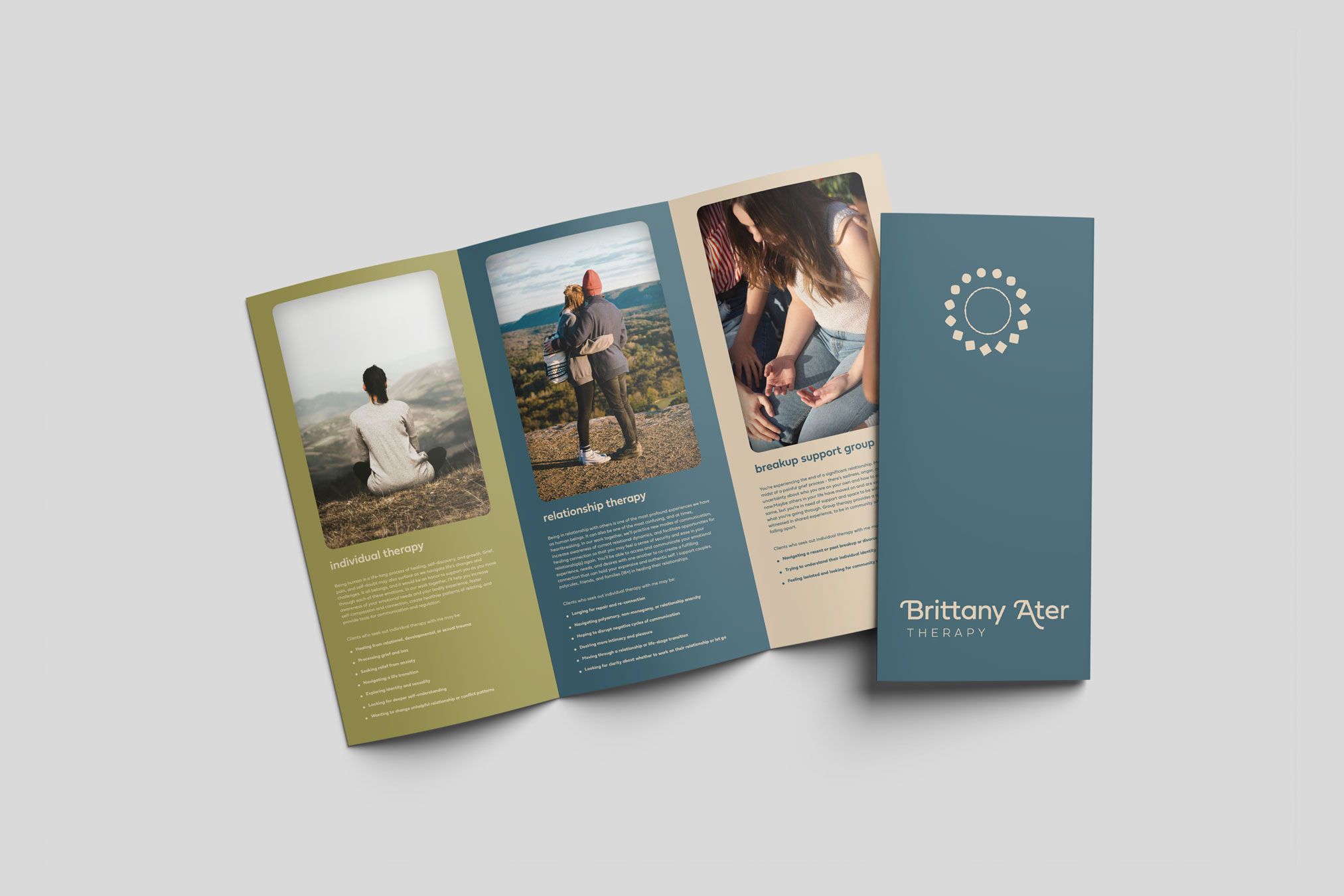
Brochures and print media help Brittany attract new clients at connections
To see the website in action, please visit brittanyatertherapy.com
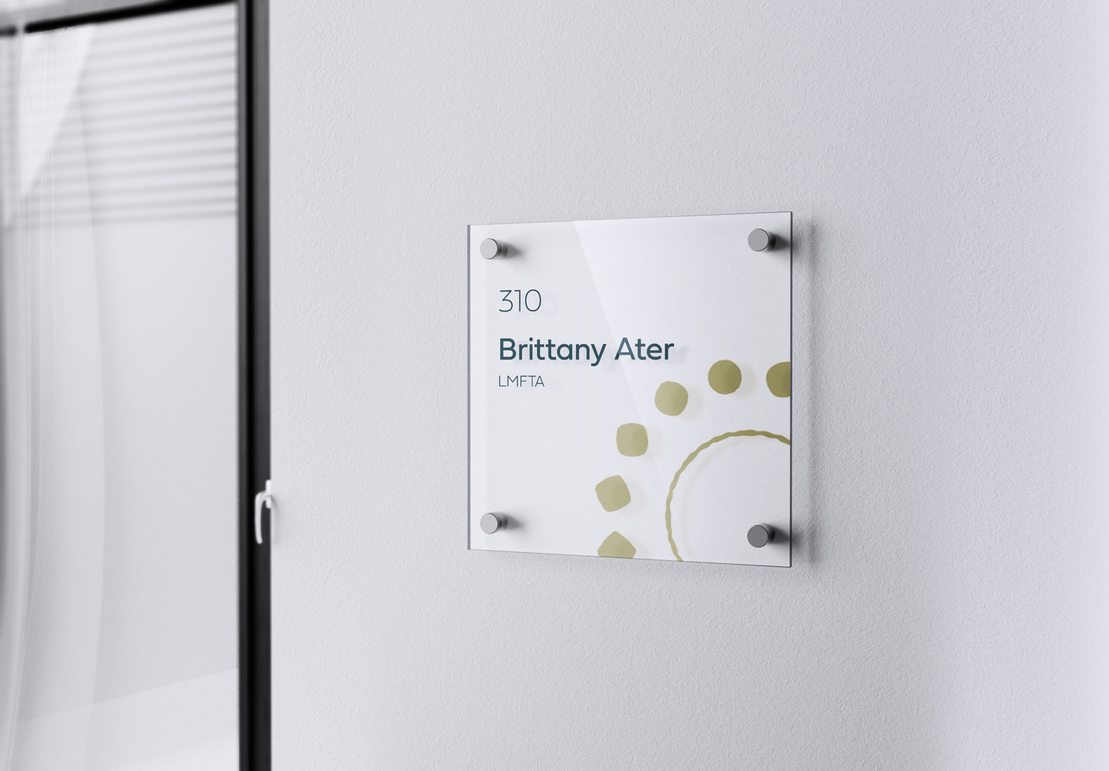
Brittany's nameplate
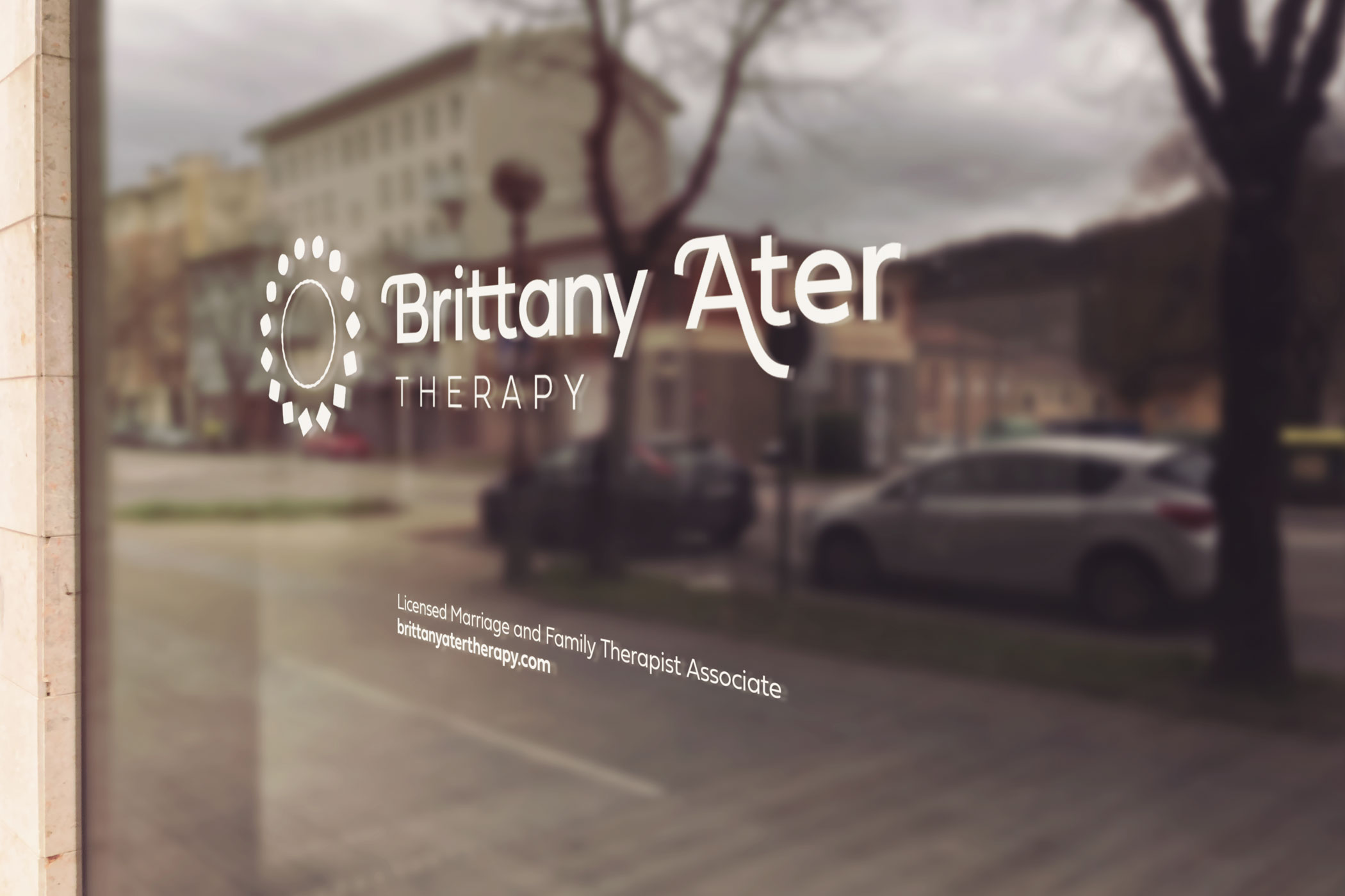
Street-facing vinyl signage outside Brittany's office is an organic way to build brand recognition
Process
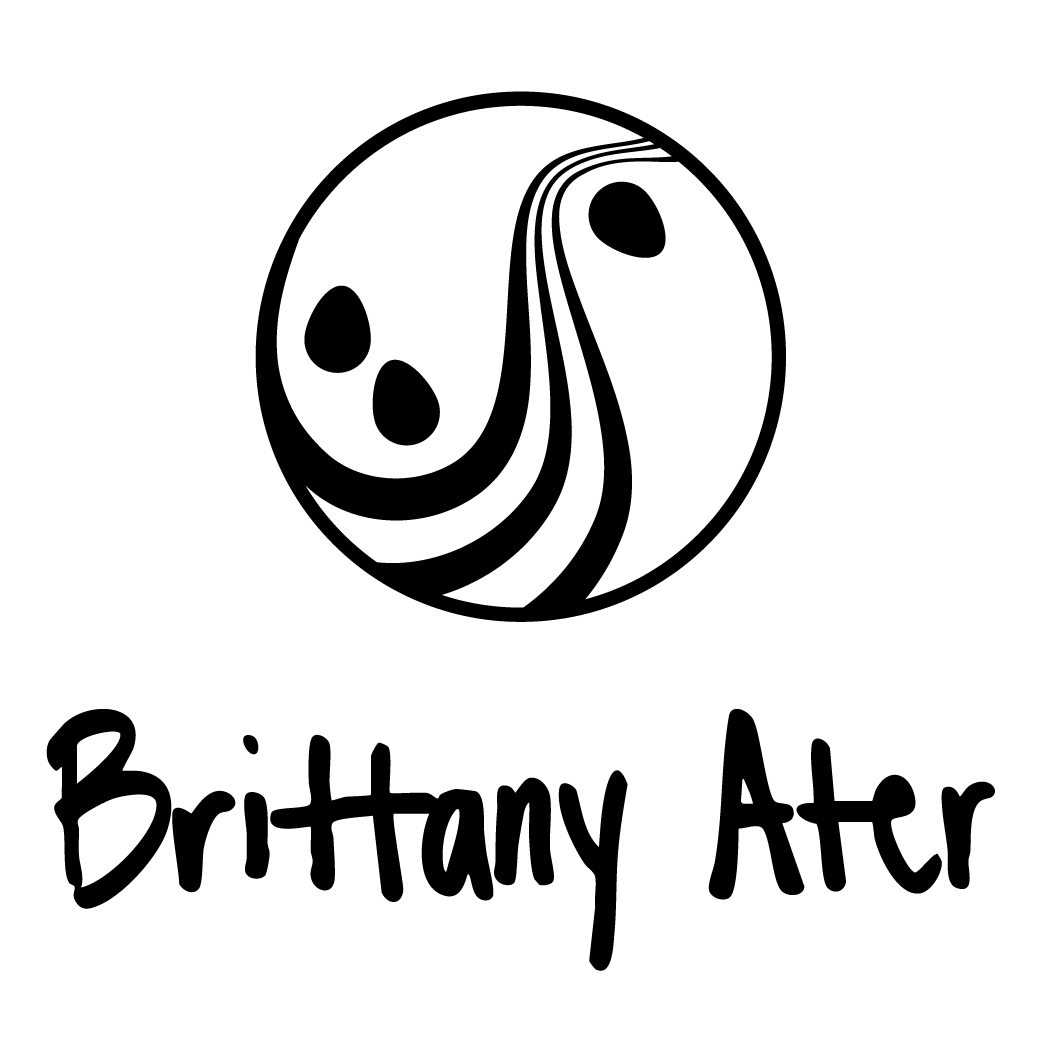
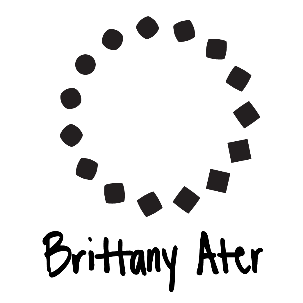
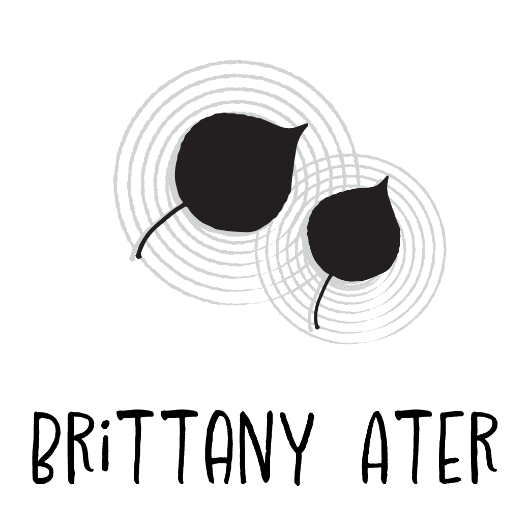
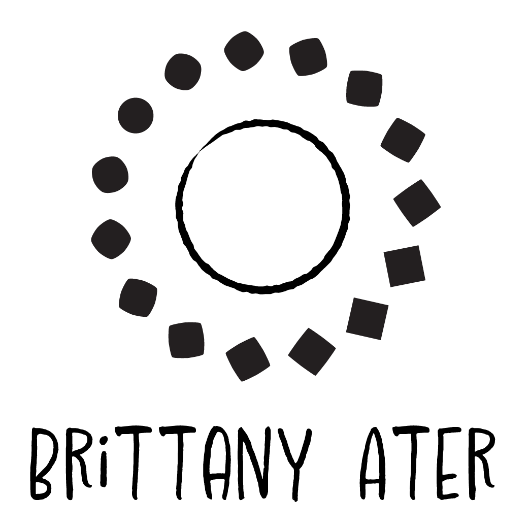
I began by sketching logos that tied together some of the imagery that we discussed in our first client meeting: the Pacific Northwest, mindfulness, yoga, leaves drifting on a stream, sunshine, and her sunflowers. The ideas that we were trying to communicate were flux, change, impermanence, and stability.
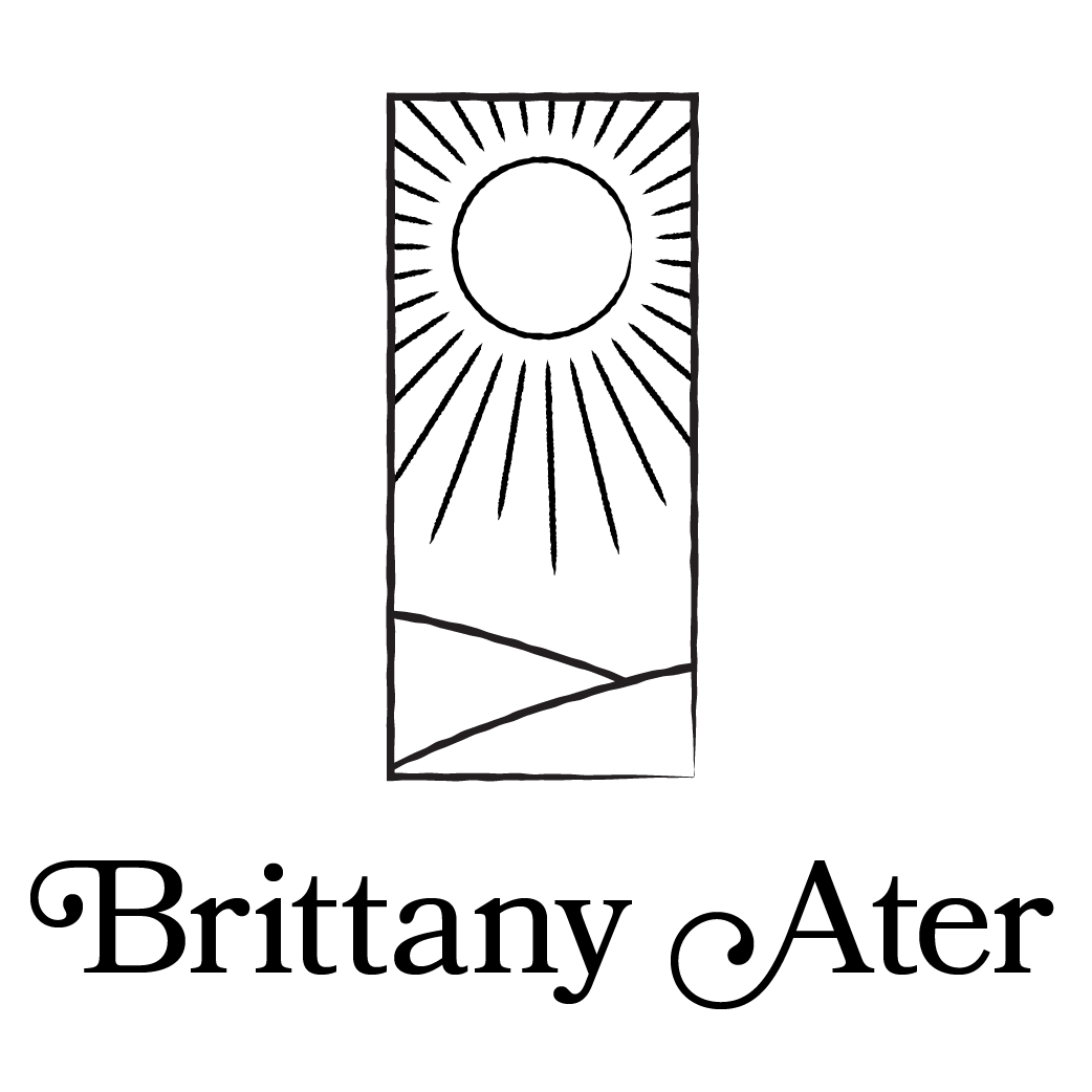


Round 1 logo vector sketches with typography options

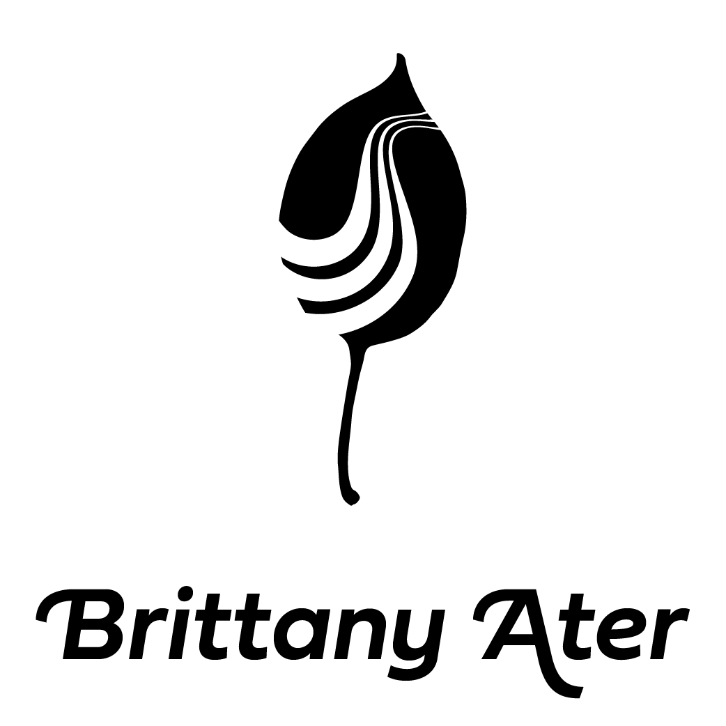
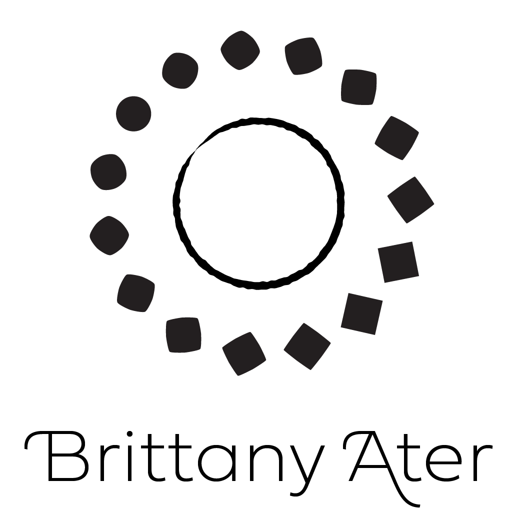
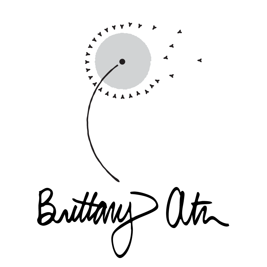
Round 2 logo vector sketches with typography options
Typography
The typeface used in Brittany's logo is an Adobe font called Fieldwork, and the variations used are Geo Thin and Geo Regular. This font is unique in that the family contains humanist and geometric variations, which will probably only be appreciated by type nerds. Fieldwork is also super cool because it has loads of gliphs and ligatures, which I took advantage of for Brittany's wordmark.
Colors
Homing in on the appropriate colors for this project took longer than the other stages of the design. Brittany was hesitant to stray too far from the color stories already told by some of her contemporaries, while I was more concerned with making her stand out. We found a very comfortable compromise in the "warm blueberry oatmeal" palette was implemented across her digital and print media.

Example of letter card
Example of game card
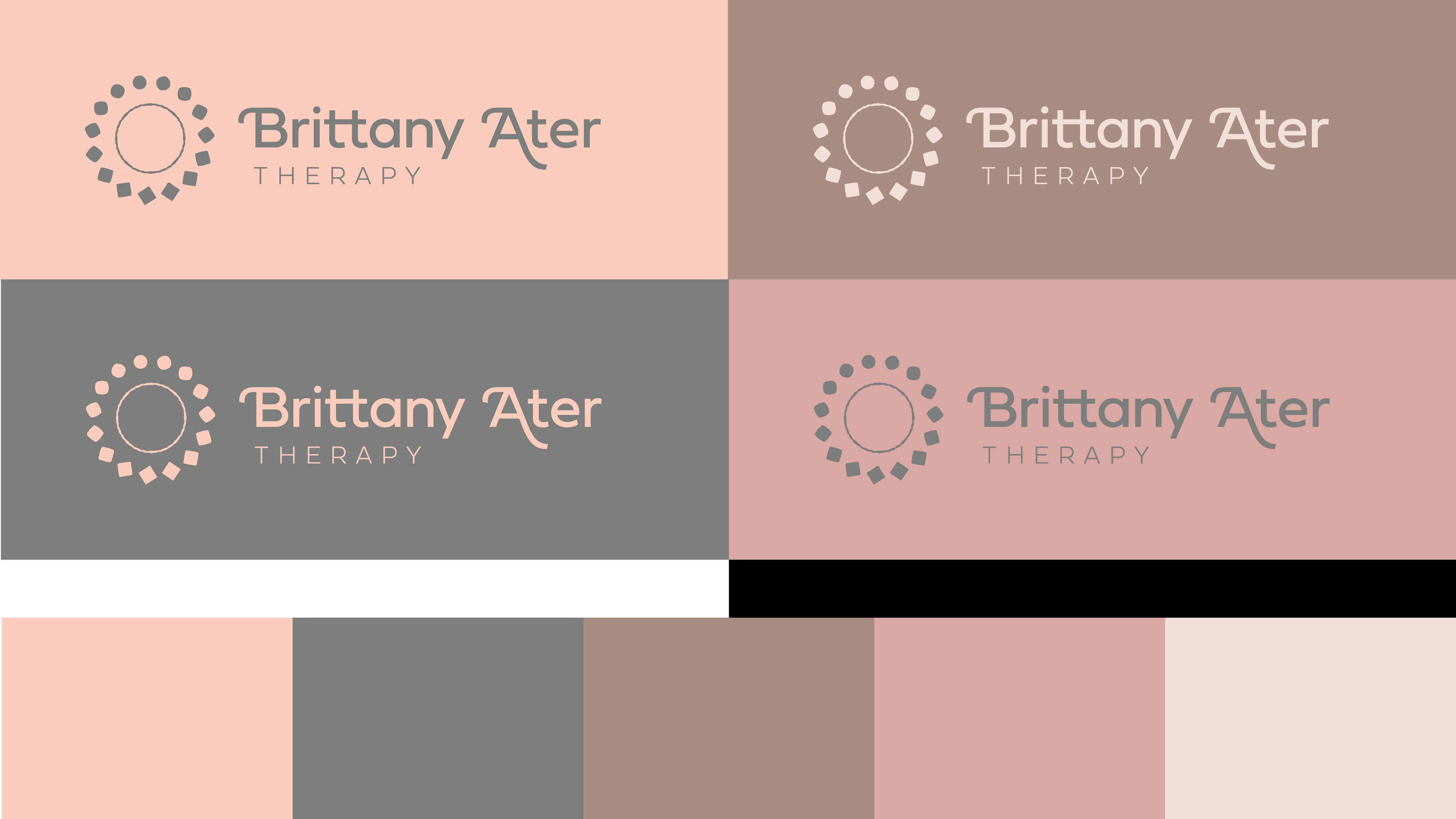
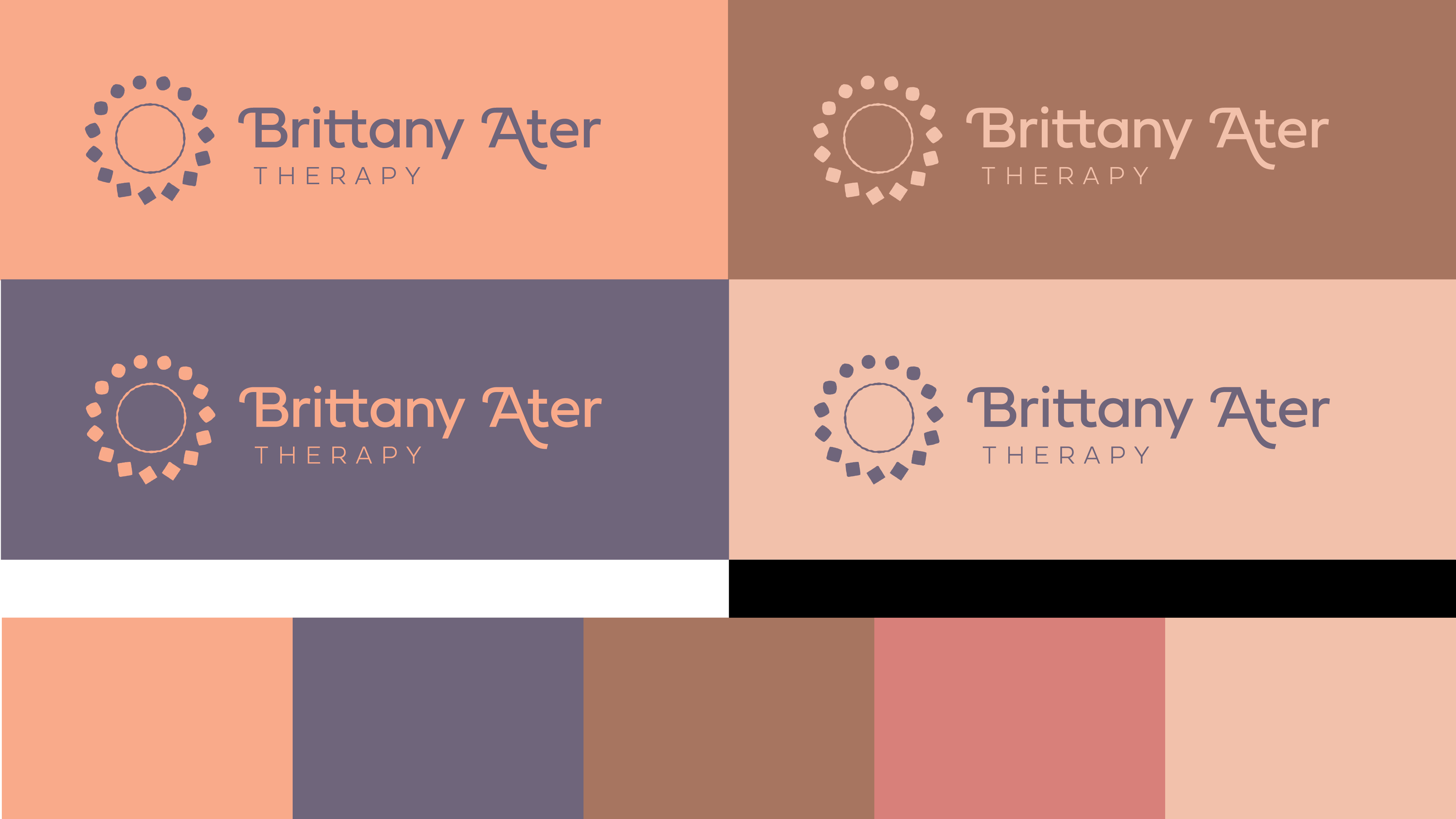
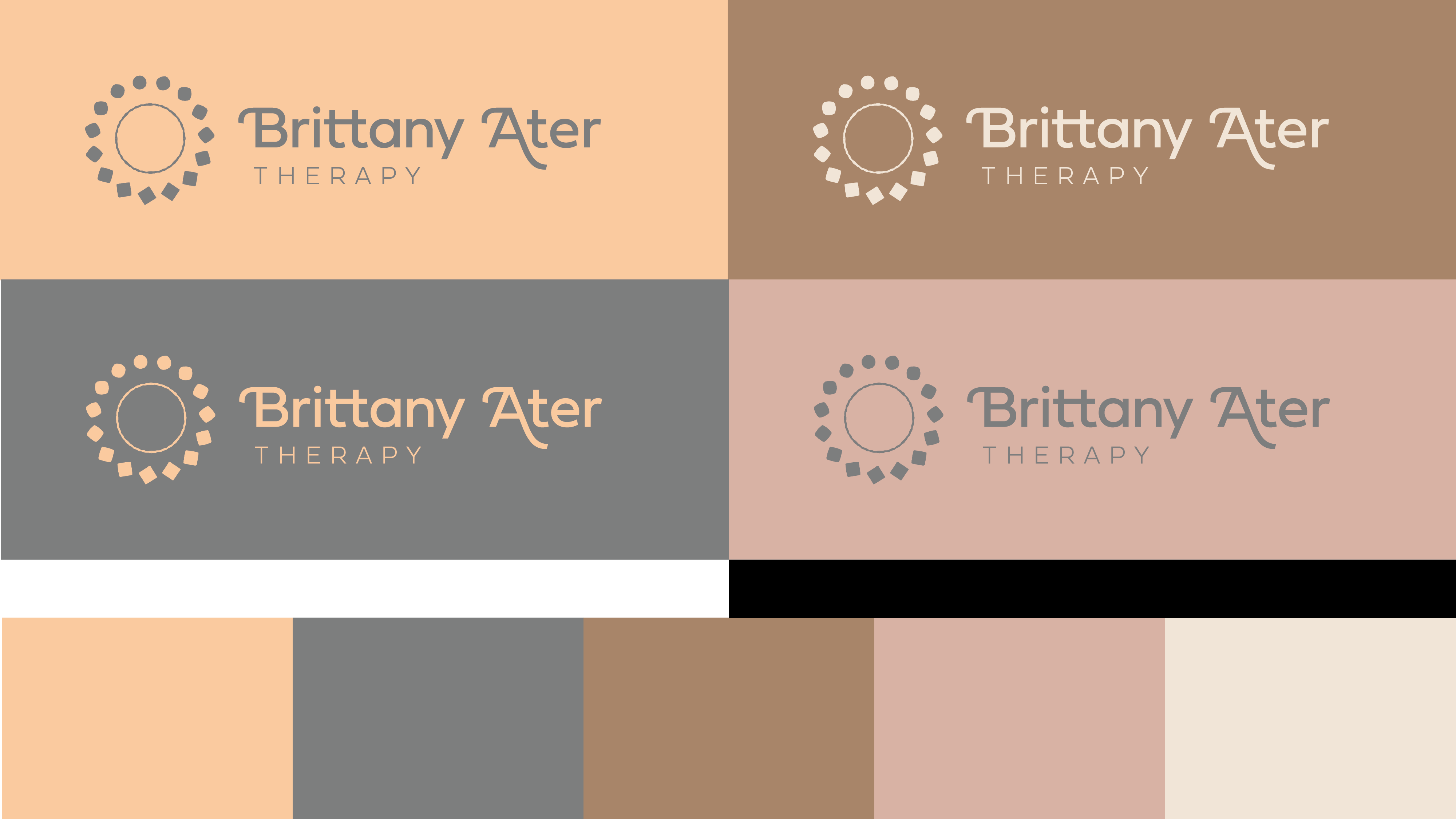
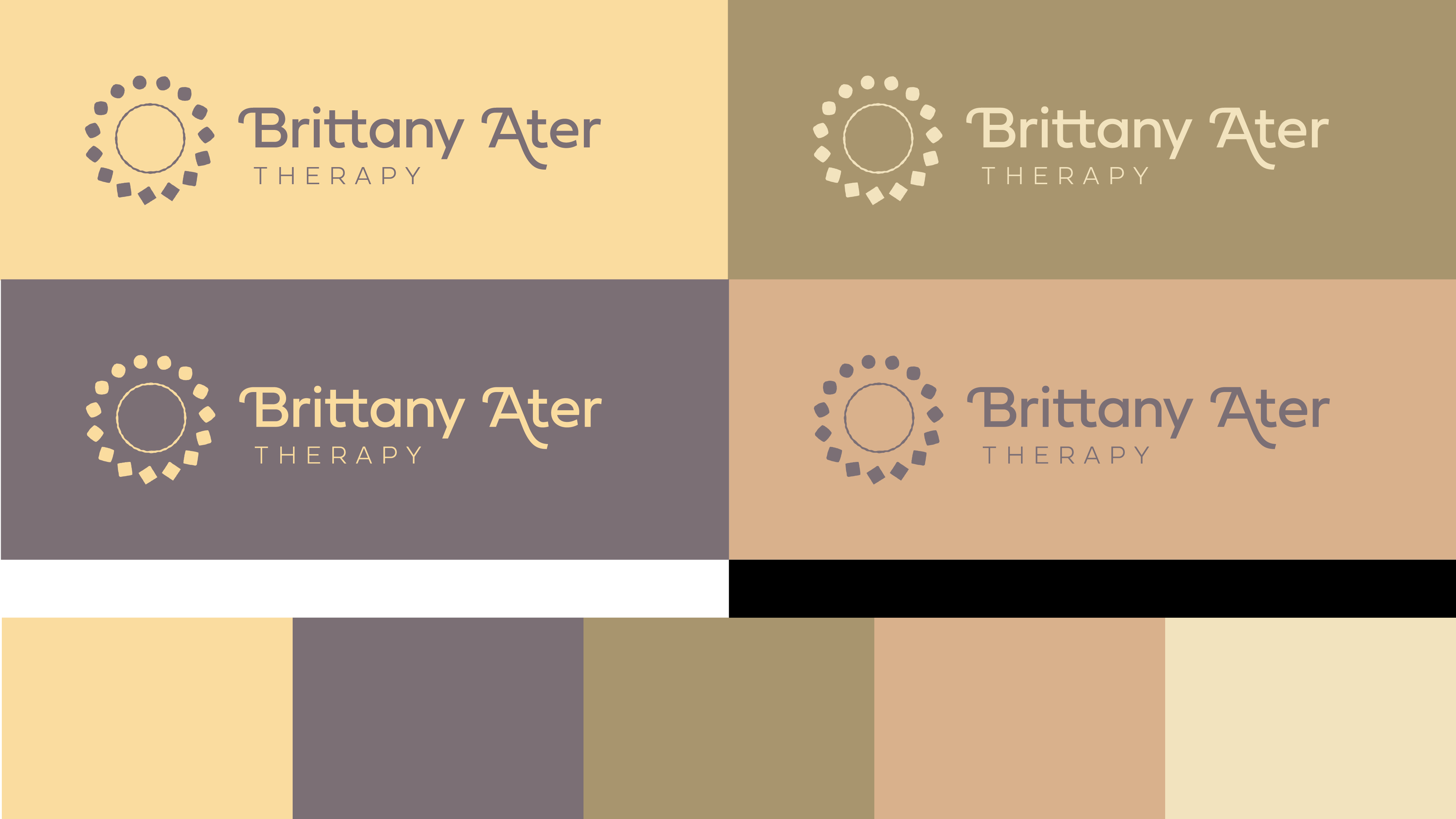
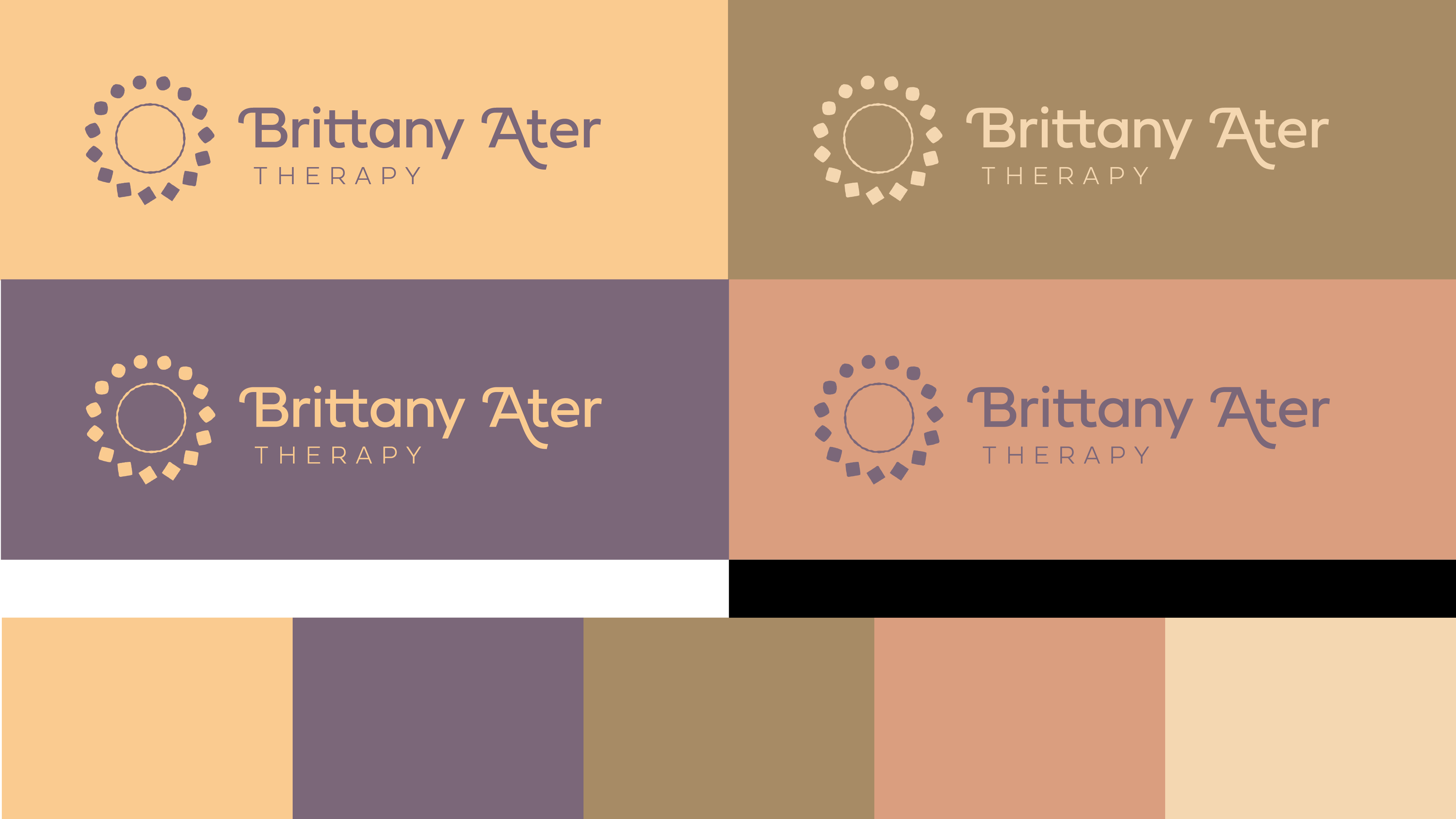
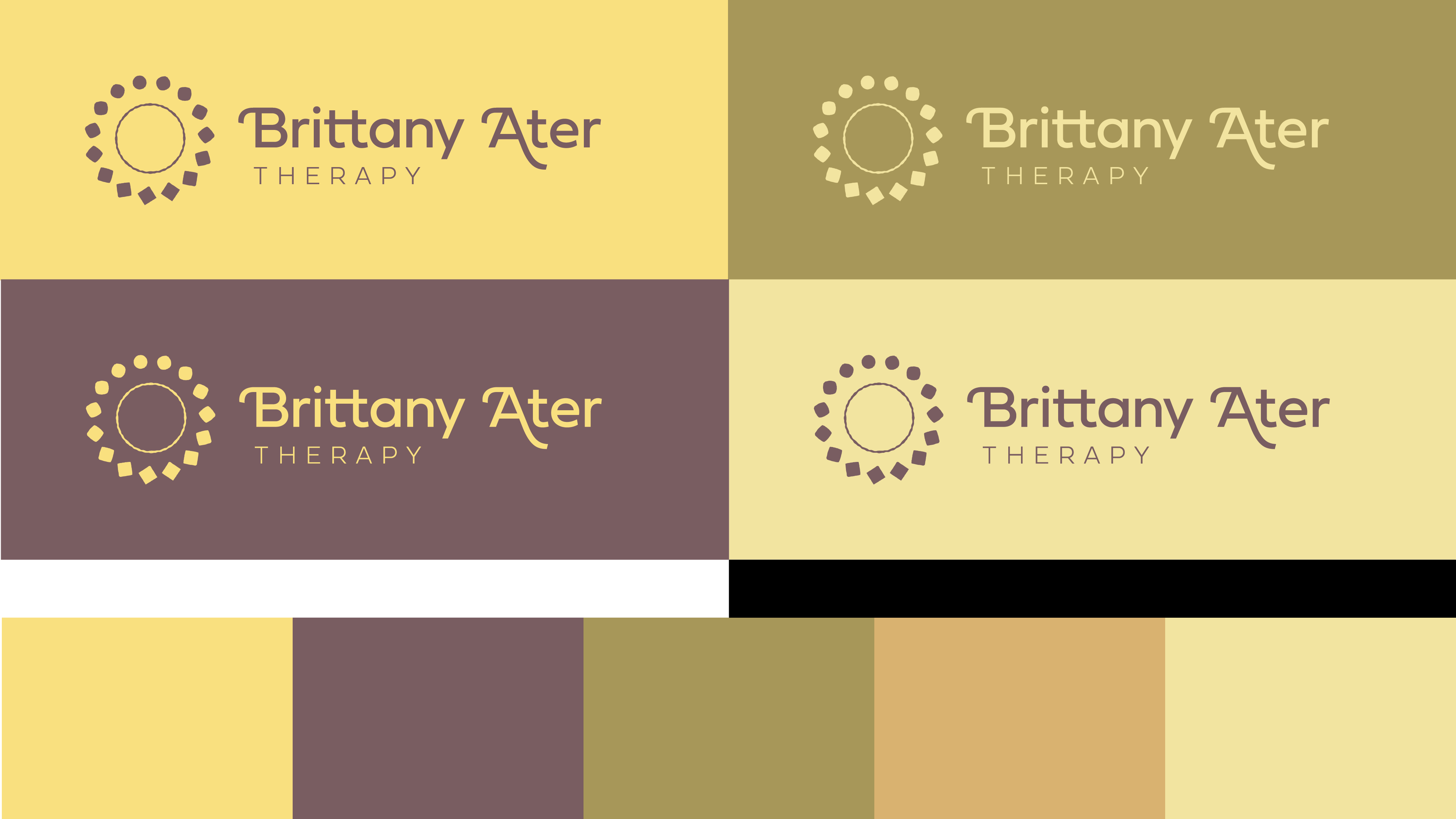
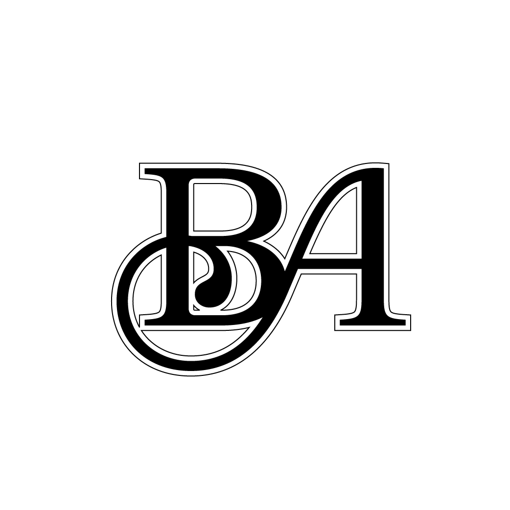
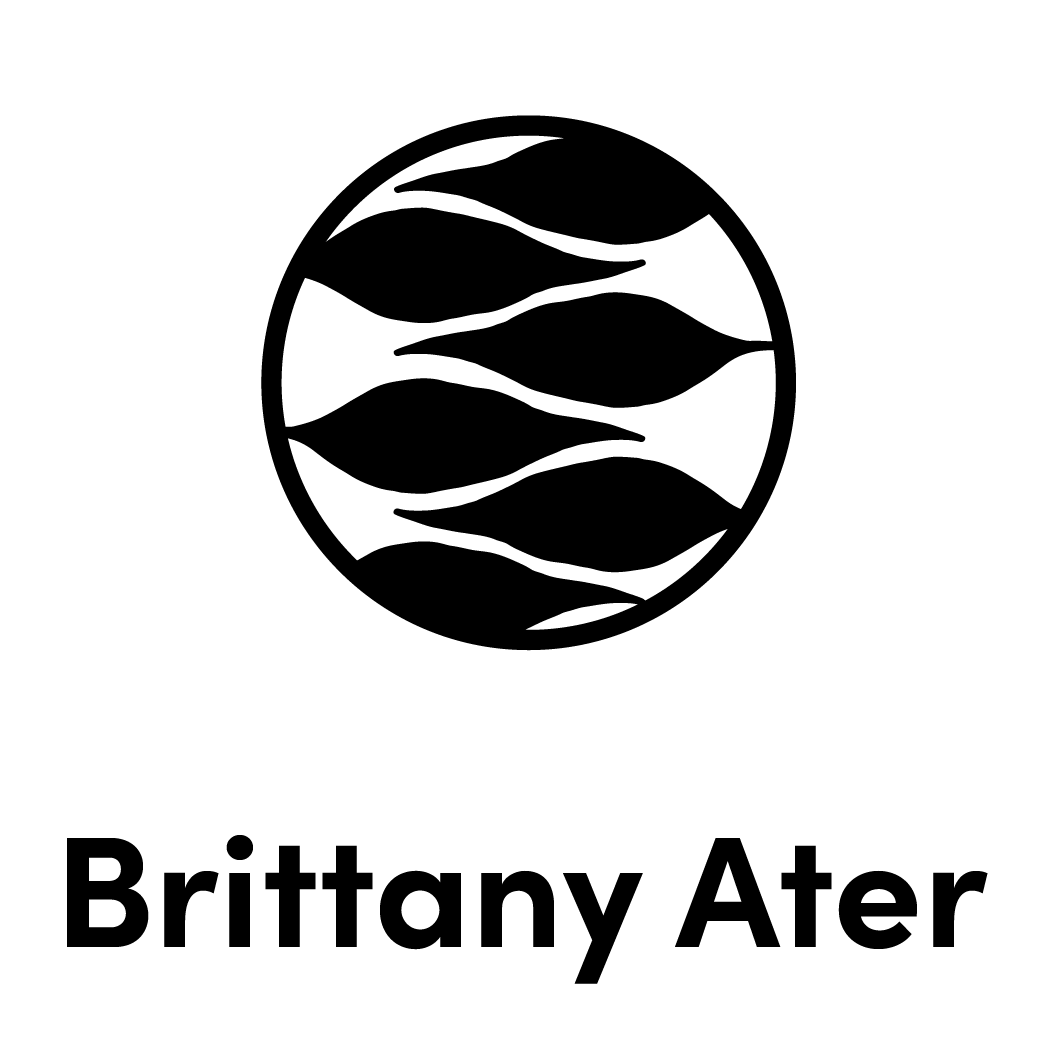
Color options for finalized logo and wordmark